Before and After #8: Contrast
|
| ||
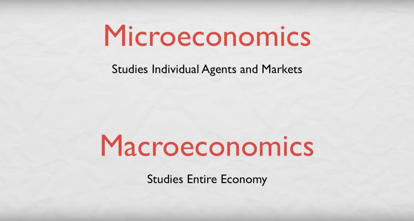
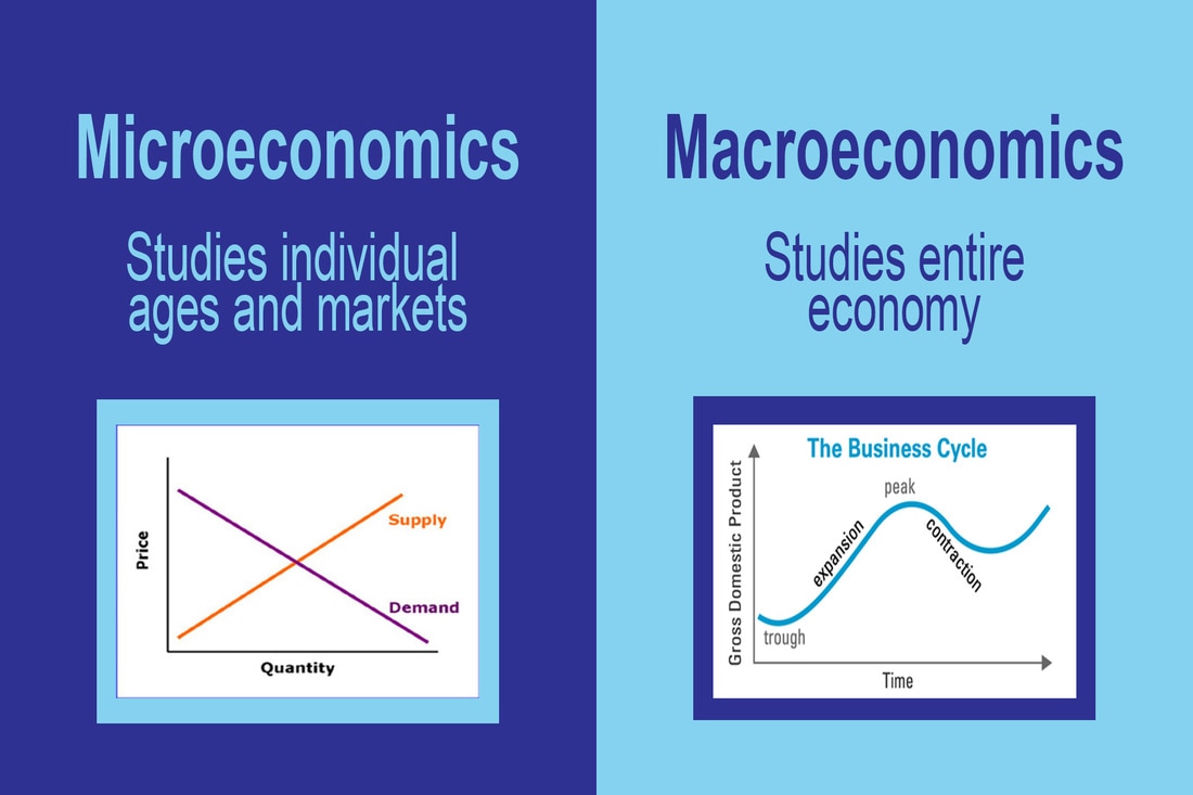
In this module, the goal was to use the design element of contrast to draw your eye to the most important information. The book says "When you place visual elements with opposing features in proximity, the contrast between the features attracts the eye." For this image I looked at how boring and plain the original image was and that when you look at it right away there is nothing that draws your eye to it. I decided to use those "opposing features" in my new design by using a color contrast and using a dark blue versus a light blue, and using the opposite font for each one. I found this contrast to make you want to look at what the information says. I think the bright colors helps to draw your attention and the use of images/graphs helps to give more of a visual definition of these two words.
