Before and After #3: Typography
|
| ||
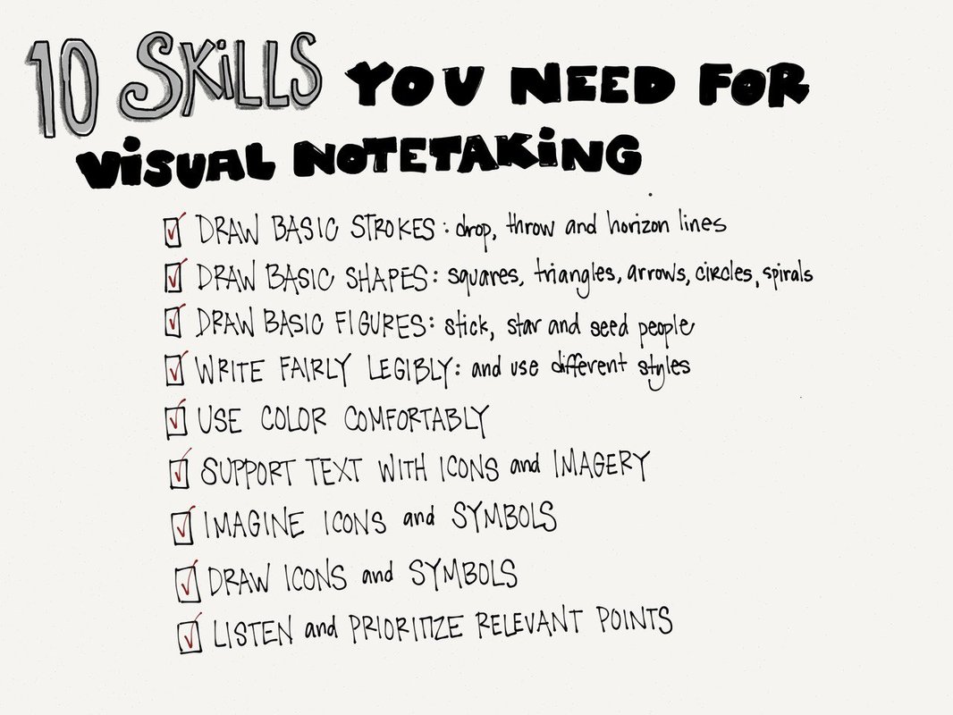
For the third before and after assignment, we were to look at the text that is used in the images. I chose the “10 Skills you need for Visual Note taking”. When I initially looked at the image I noticed it looked like someone’s handwriting and parts of it was hard to read. The text used for the title is all over the place and does not look all uniform. The same is for the list below it.
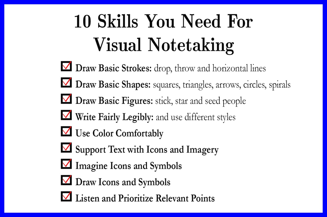
To fix some of these issues I decided to use a combination of two serif fonts Euclid and Garamond. The Euclid was used to create the title and to bring attention to what this poster is being used for. I made this font larger than the other words so it would stand out. The list is the part created with Garamond. I decided to bold face the important 10 skills that they needed while leaving the “extra” info in regular text type. I felt like the fact that there was no color on this poster made it hard to draw your attention in any direction. Therefore this is why I added the red check marks to the boxes in front of each part of the list to draw your eyes to the list. Also, I added the blue border to give it a little something to look at.
To fix some of these issues I decided to use a combination of two serif fonts Euclid and Garamond. The Euclid was used to create the title and to bring attention to what this poster is being used for. I made this font larger than the other words so it would stand out. The list is the part created with Garamond. I decided to bold face the important 10 skills that they needed while leaving the “extra” info in regular text type. I felt like the fact that there was no color on this poster made it hard to draw your attention in any direction. Therefore this is why I added the red check marks to the boxes in front of each part of the list to draw your eyes to the list. Also, I added the blue border to give it a little something to look at.
