Before and After #5: Visual Hierarchy
|
| ||
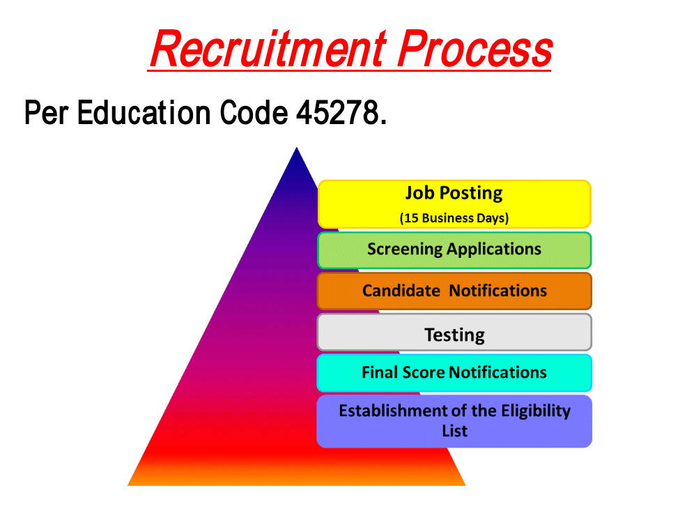
In this assignment, the goal was to show how visual hierarchy and what you see when you first look at an image. I chose the recruitment process image for this assignment. Right away when you look at it the first thing you notice is the large triangle in the middle with some very crazy colors. The words around it do not immediately draw your attention and therefore you are unaware of what you are looking at. Although the title is bright and red, the information below it makes the whole image confusing.
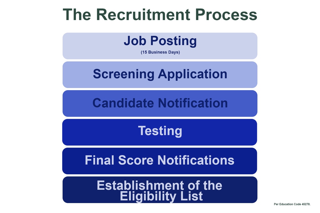
To achieve visual hierarchy, I first centered the title at the top of the page and moved the other information to the bottom corner as I did not feel it was totally necessary. I decided with the colors to use different hues within the same range of the color blue. I started at the top with lightest blue and the darkest one at the bottom. This allows your eyes to clearly follow the steps.
To achieve visual hierarchy, I first centered the title at the top of the page and moved the other information to the bottom corner as I did not feel it was totally necessary. I decided with the colors to use different hues within the same range of the color blue. I started at the top with lightest blue and the darkest one at the bottom. This allows your eyes to clearly follow the steps.
