Before and After #1: Graphic Space
|
| ||
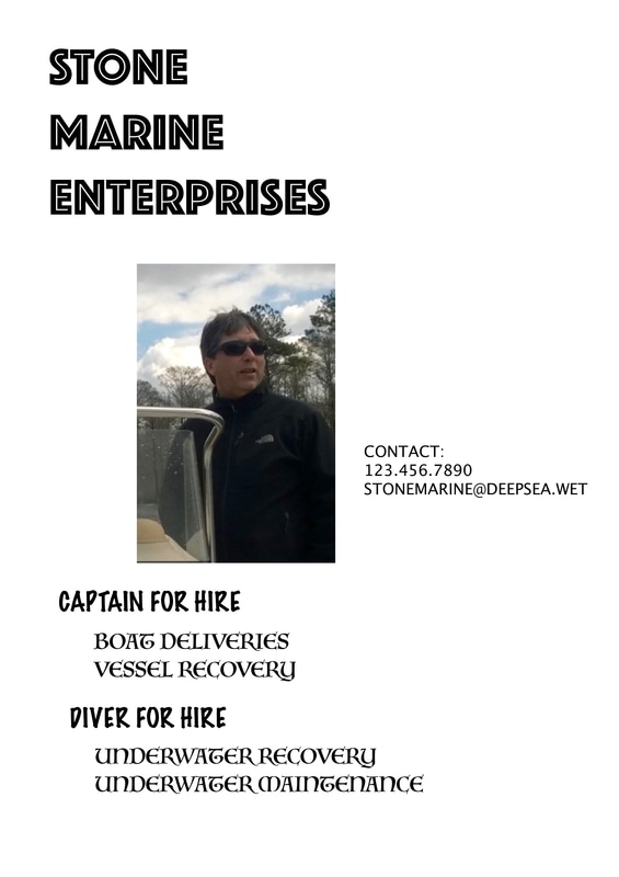
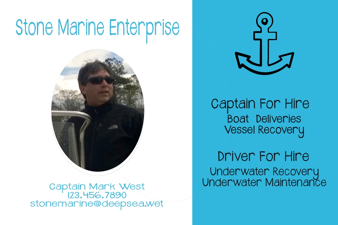
For this assignment on graphic space, I decided to start with the Stone Marine Enterprises image. The before image did not make good use of its graphic space. Everything was just kind of throw onto the page with no balance of positive and negative space. I noticed from the beginning that there was way too much white space which did not comply with the alignment principles. Due to the white space in the graphic it caused your eyes to move away from the important information and into the empty spaces. The margins of the image did not make sense and the placement of the text was very off balance with most of it to the left of the image and only one piece to the right. To fix this image I first tried to create more balance while still making sure there was enough white space. I did this by dividing the image into two groups with the image on the left and the text with a blue background on the right. I tried to balance the text onto both sides to make it look more symmetrical. I also tried to give this some kind of layout as this was lacking in the initial version. For the text I picked something that was a little rounder and a color that was more inviting.
